Category: Programs + Menus
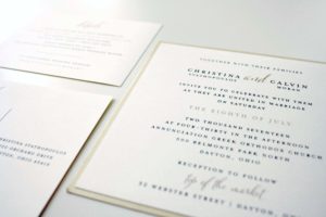
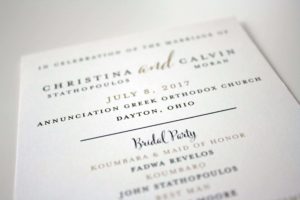
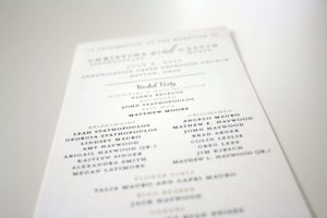
Christina + Calvin
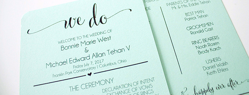
Bonnie + Michael
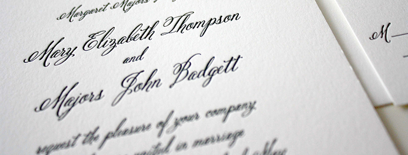
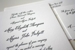
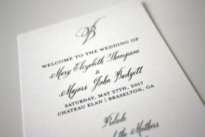
Mary Elizabeth + Majors
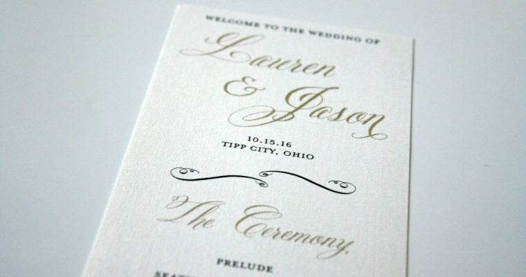
Lauren + Jason
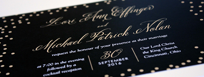
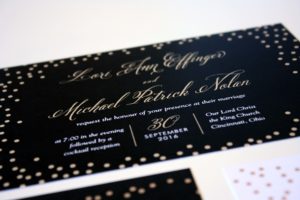
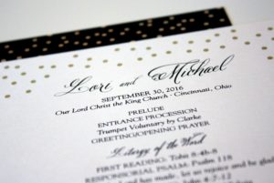
Lori + Michael
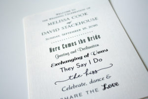
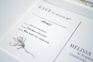
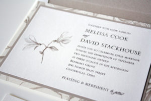
Melissa + David
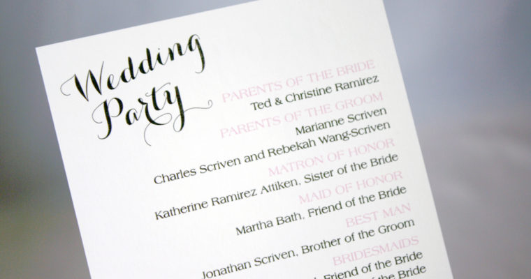
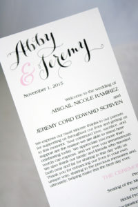
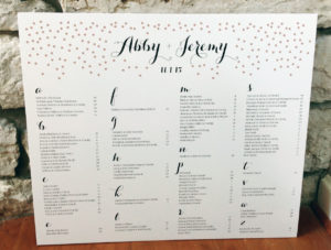
Abby + Jeremy
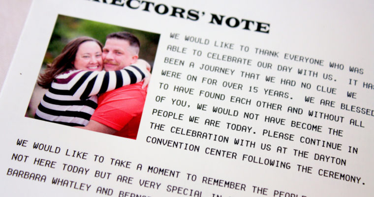
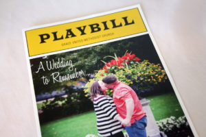
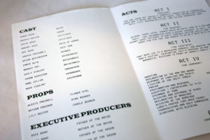
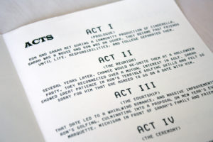
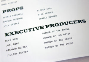
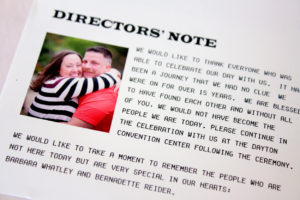
Broadway Playbill
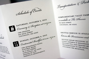
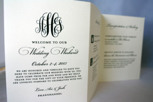
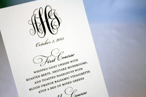
Ari + Josh
Emily + Blake
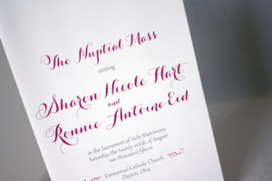
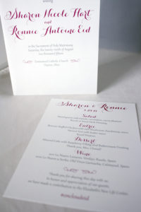
Sharon + Ronnie
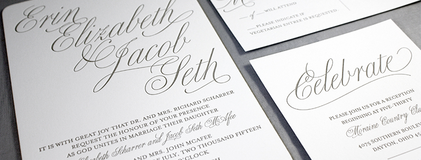
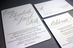
Erin + Seth
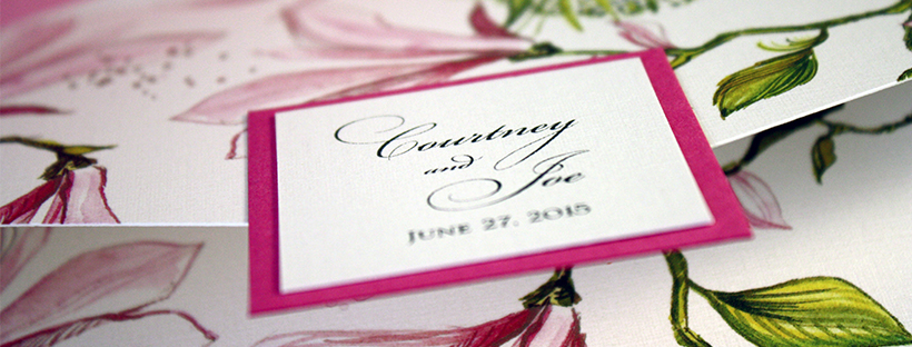
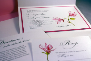
Courtney + Joe
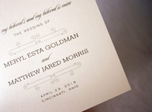
Meryl + Matt
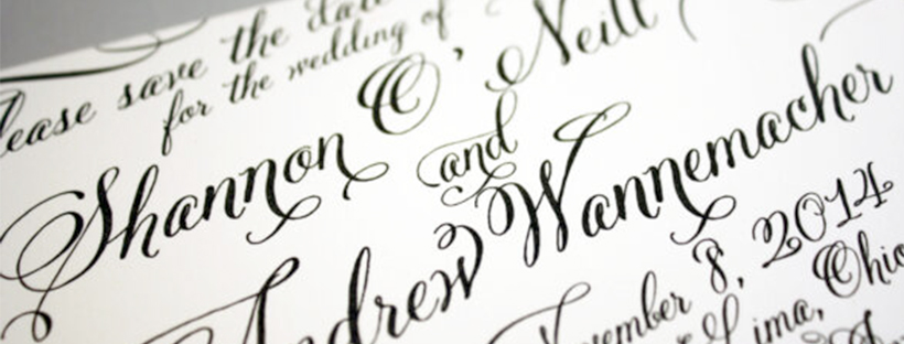
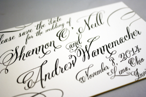
Shannon + Andrew
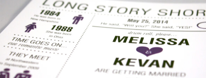
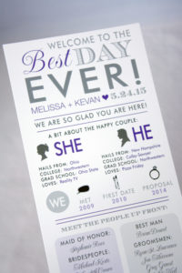
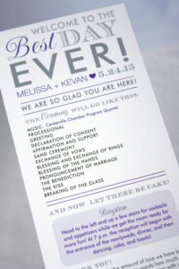
Melissa + Kevan
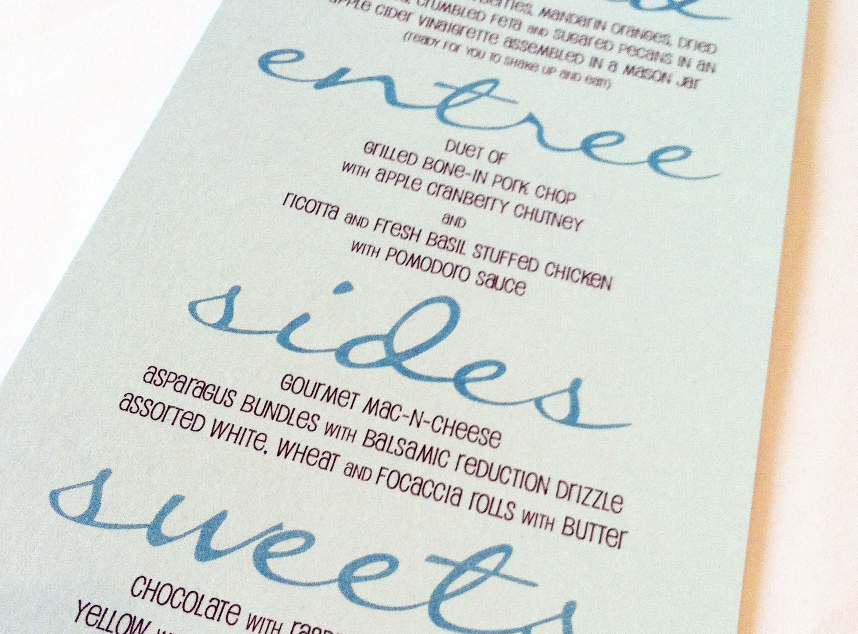
Modern Script Menu
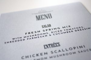
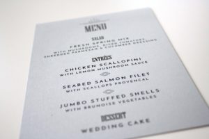
What makes this menu stand out is the large script that bleeds almost all the way to both edges. It was a cool way to let guests know what they were being served, and matched the colors of the wedding as well, serving up a nice compliment to the table settings.
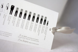
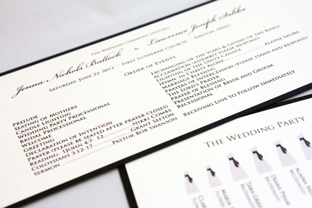
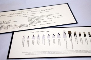
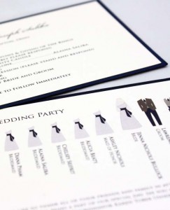
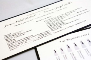
Bridal Party Silhouette Programs
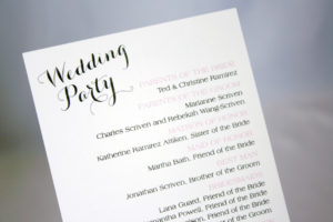
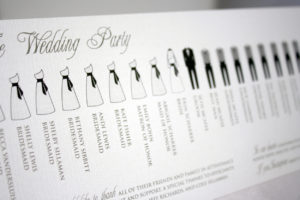
This was one of our more popular designs for wedding programs during Summer and early Fall, and involved the use of bridal party graphics to provide a fun visual break in the text. Of course, we customize the colors of the paper and ink with the bride and groom’s wedding color palette, and could easily switch up the font for a less traditional look as well.
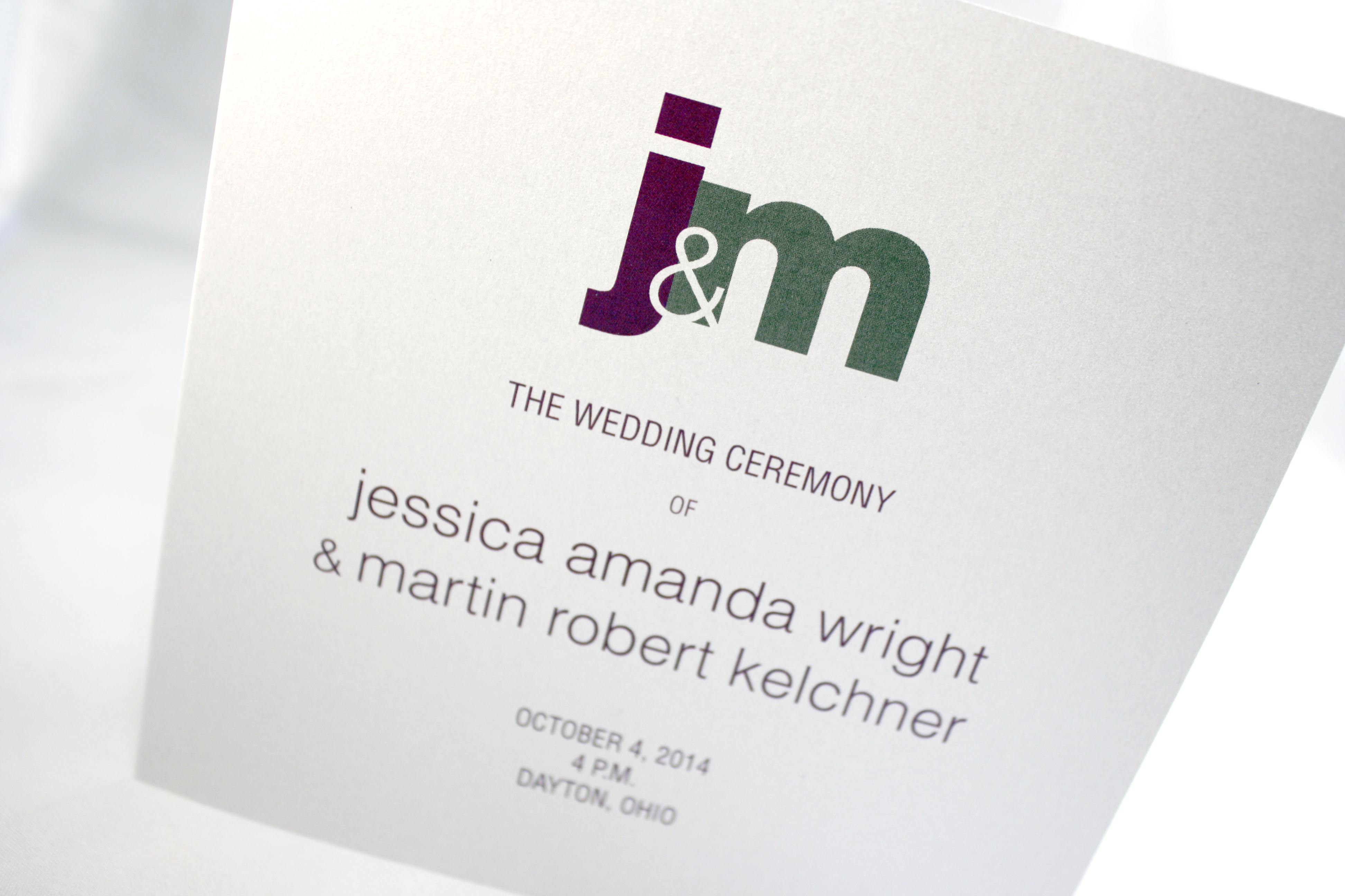
Jessica + Martin
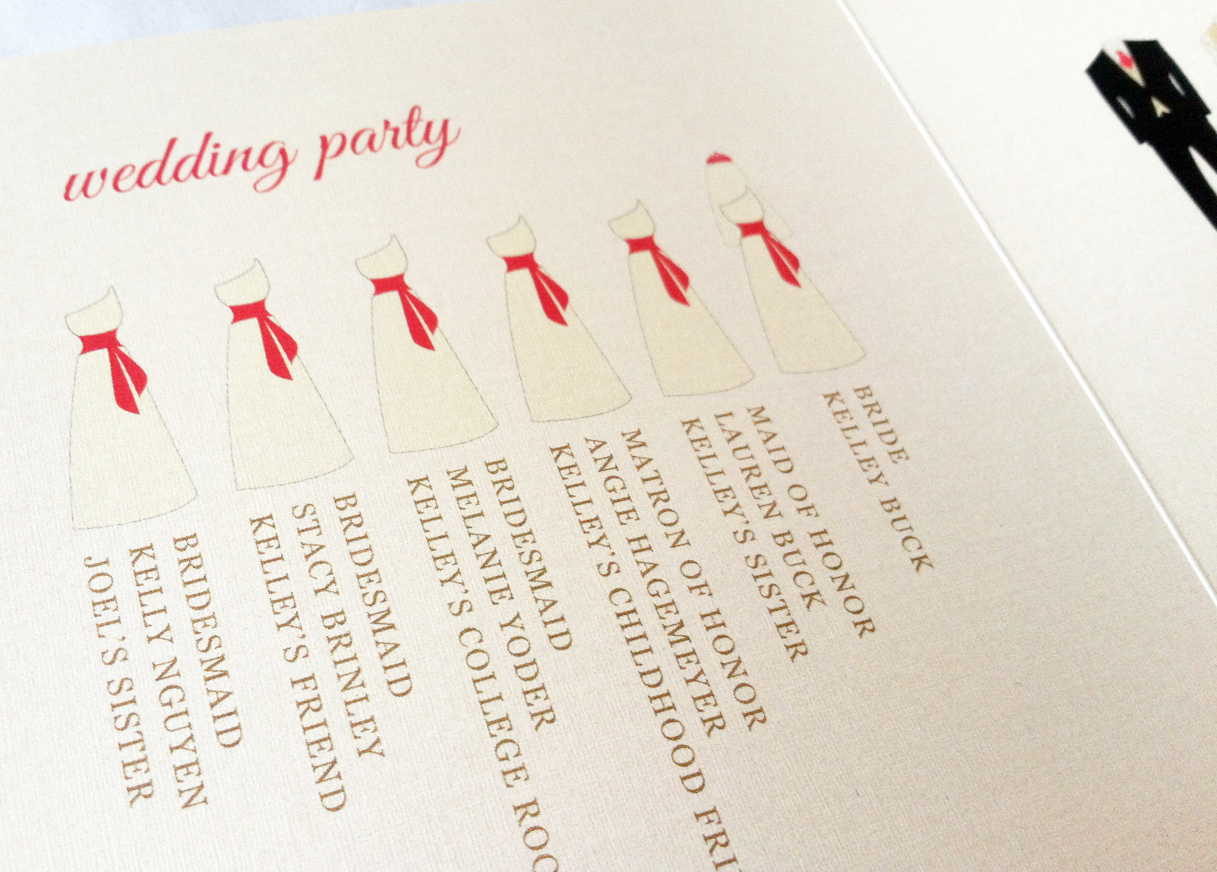
Kelley’s Wedding Program
We keep getting requests for bridal party silhouettes on wedding programs, which is fun because we are able to change up the colors involved, as well as the style of the program. This was a trifold square program on a raw silk ecru card stock, using the bride’s colors of coral, gold and ecru.
Katie + Tal
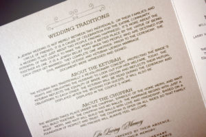
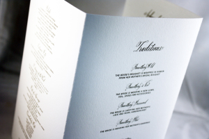
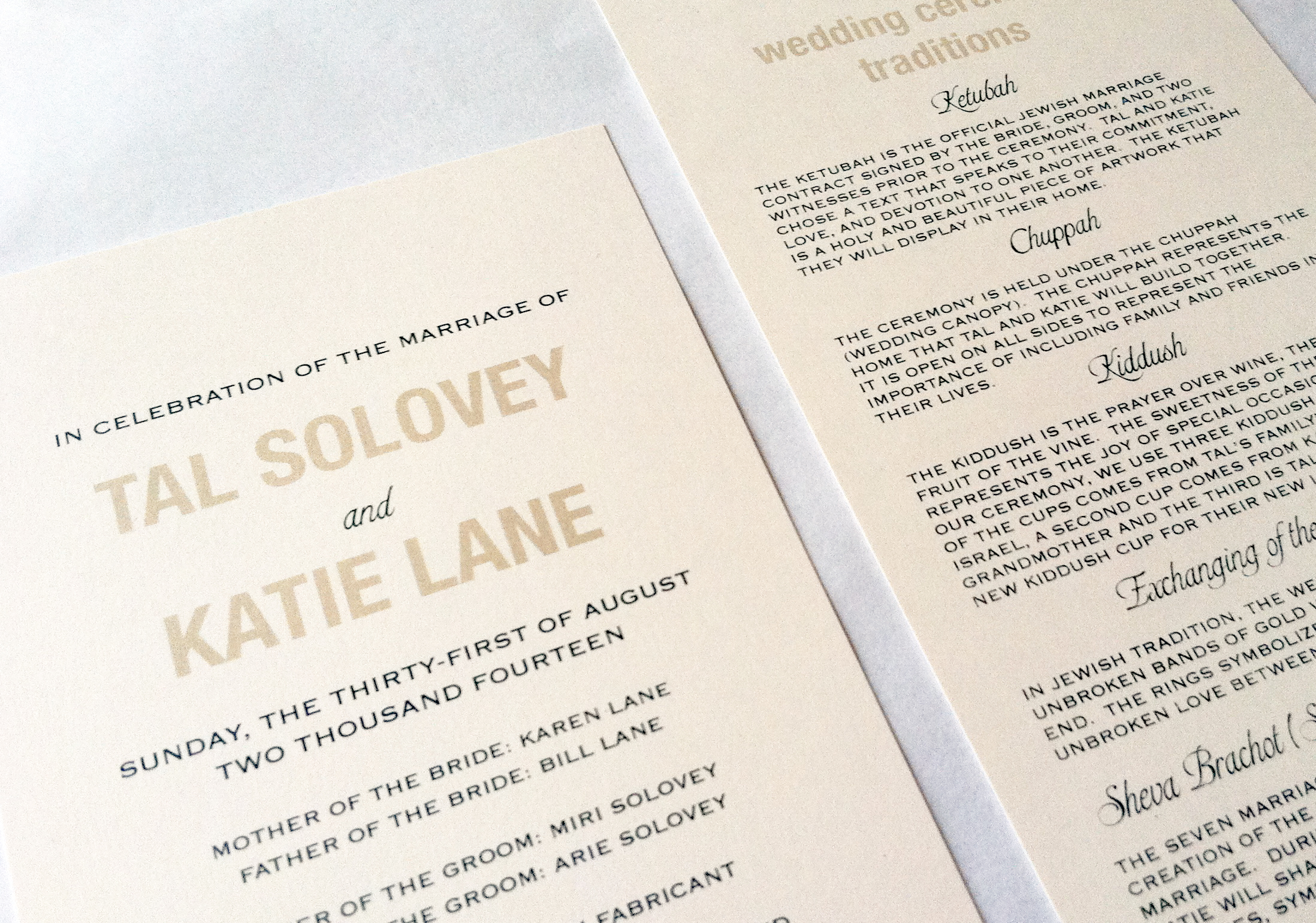
A great change of pace from most traditional programs, this single card two-sided wedding program explained Jewish wedding traditions in lieu of simply listing the order of ceremony events. I really loved putting this program together to match the invitation Katie and Tal chose, as well as read about the various traditions involved in their wedding ceremony. I would be willing to bet some of their guests found the information interesting and useful as well.
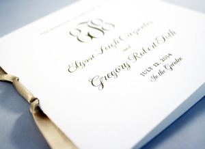
Elyse + Greg
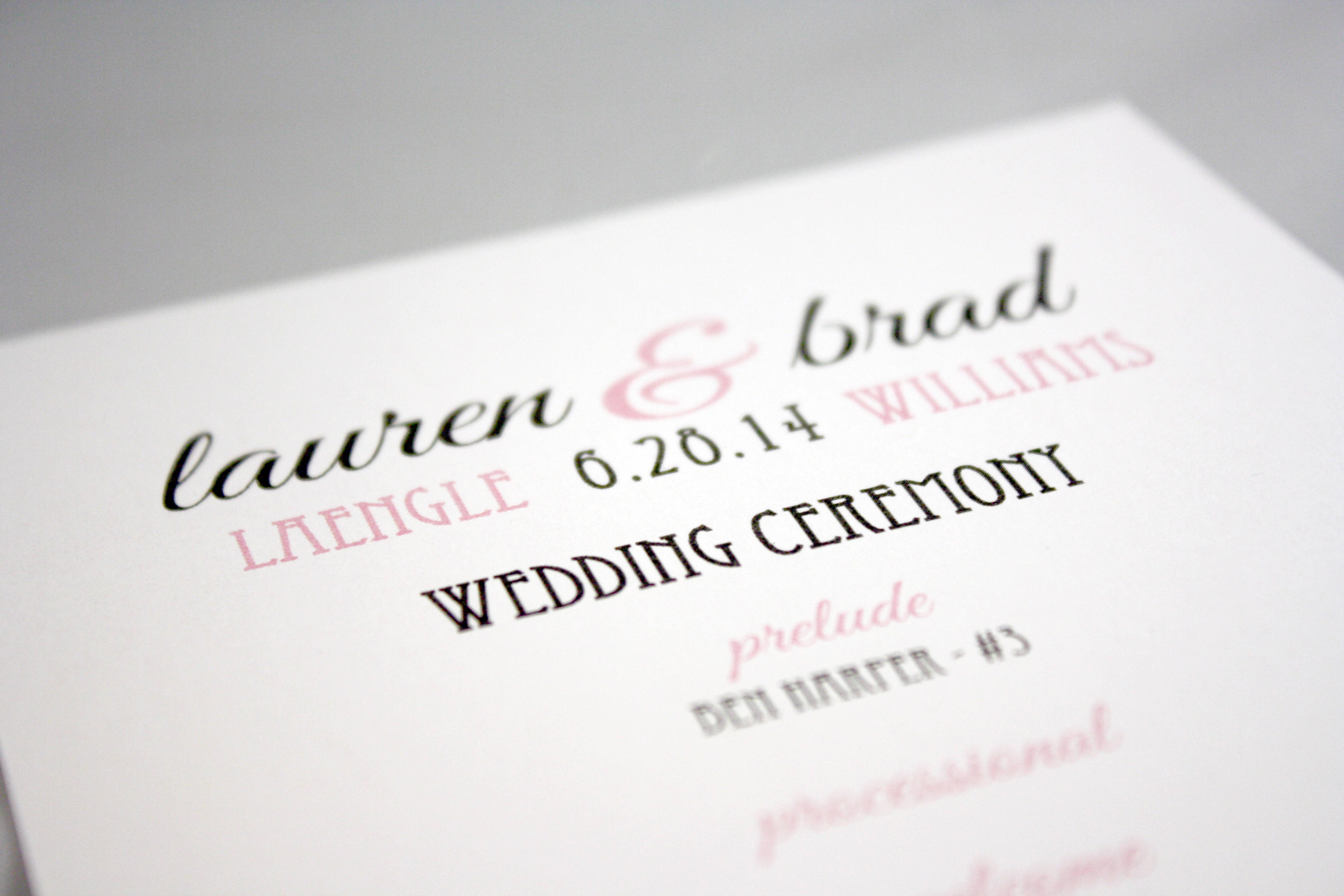
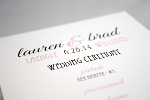
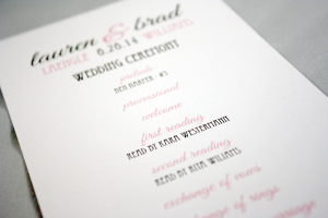
Lauren + Brad
Art deco font wedding program in pink and grey
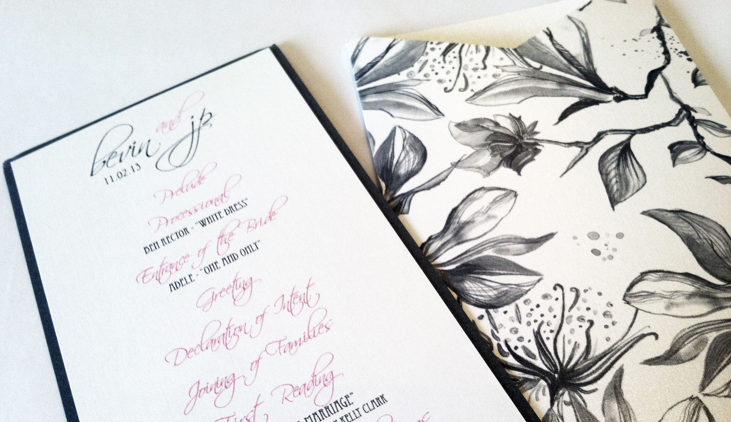
Floral pocket program
This little pink and grey floral pocket program was fitting for the garden wedding it accompanied, and the sleeve ended up protecting the programs when it started to rain. They say rain on your wedding day is supposed to be good luck…
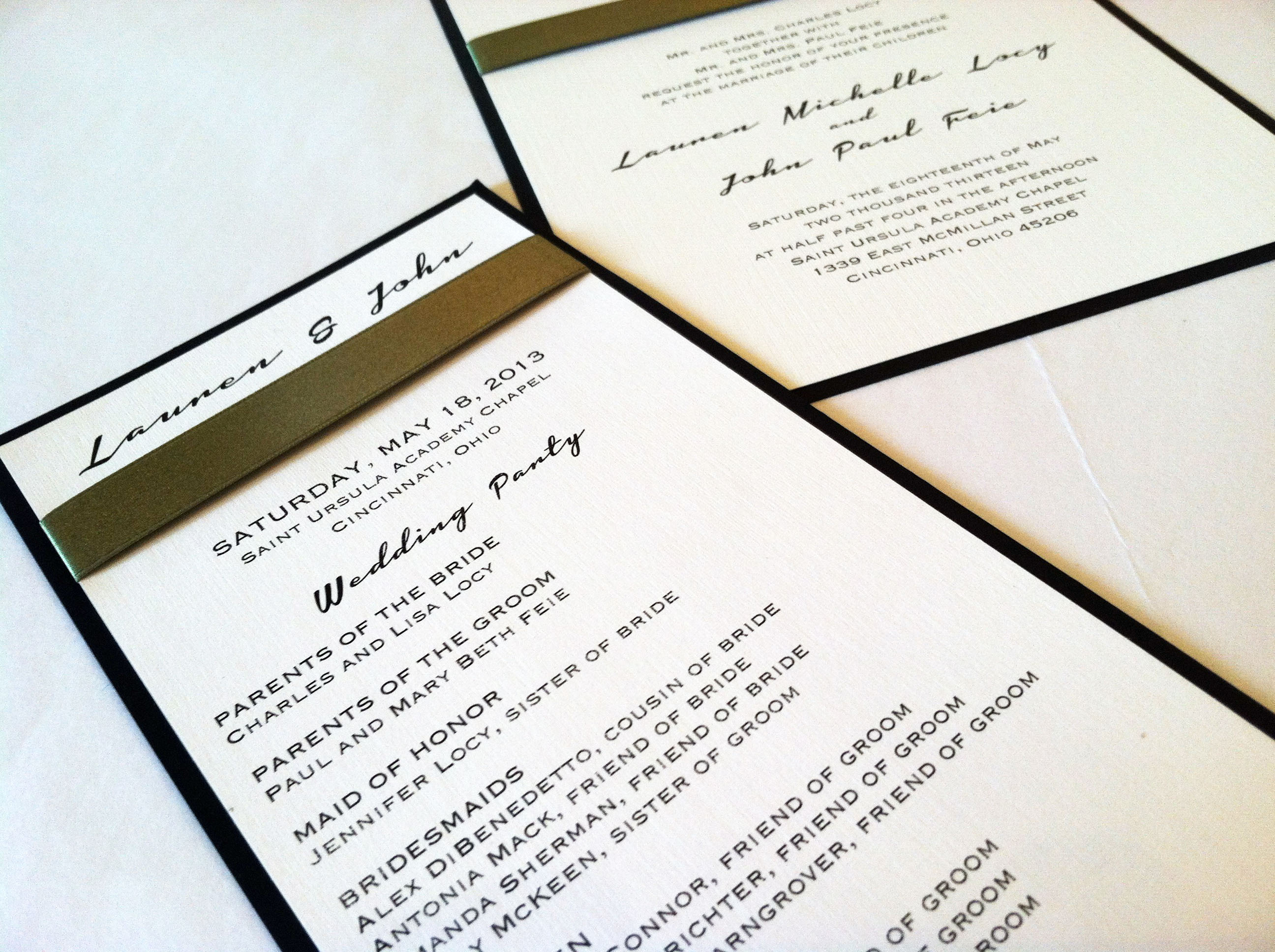
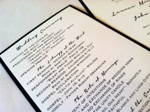
Lauren + John
Green ribbon across the top ties the invitation and the program together (not literally), while the black and white and funky script makes these invitations crisp and modern.
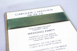
Caroline + Matt
Caroline and Matt’s program was a delightful compliment to their layered gold and ivory wedding invitation, from the layers of gold and ivory, right down to the moss satin ribbon.
Kate + Pete
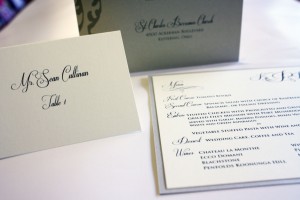
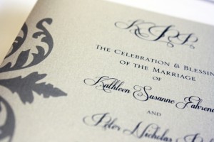
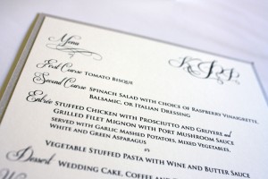
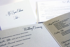
Kate had one heck of a wedding planner in her corner for this fabulous October wedding- her wonderful mom, Monica. Together, we planned every printed detail of this wedding from start to finish: the invitations, programs, rehearsal dinner invitations, place cards, menus, thank you notes…the whole kit and kaboodle. Kate’s invitations were from Checkerboard, and she wanted a traditional elegance theme- ivory and black with touches of gold and silver. Featured here are her programs, place cards and menus.
A + B Programs
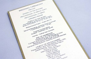
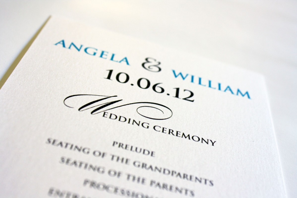
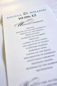
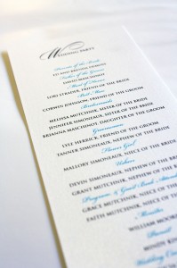
Angela’s Tiffany blue and mocha wedding needed a simple program to match, and by the time she made it to the program stage of things, Angela was tired of making decisions and asked me to suggest something simple and easy that wouldn’t break the bank. Our go-to program in situations like these is a 4×9 card, printed with ceremony information on the front and wedding party on the back. With a reasonable cost, no assembly and a high likelihood that people would tuck them into their purses after the ceremony, this was a no-brainer.
Carrie + Mike
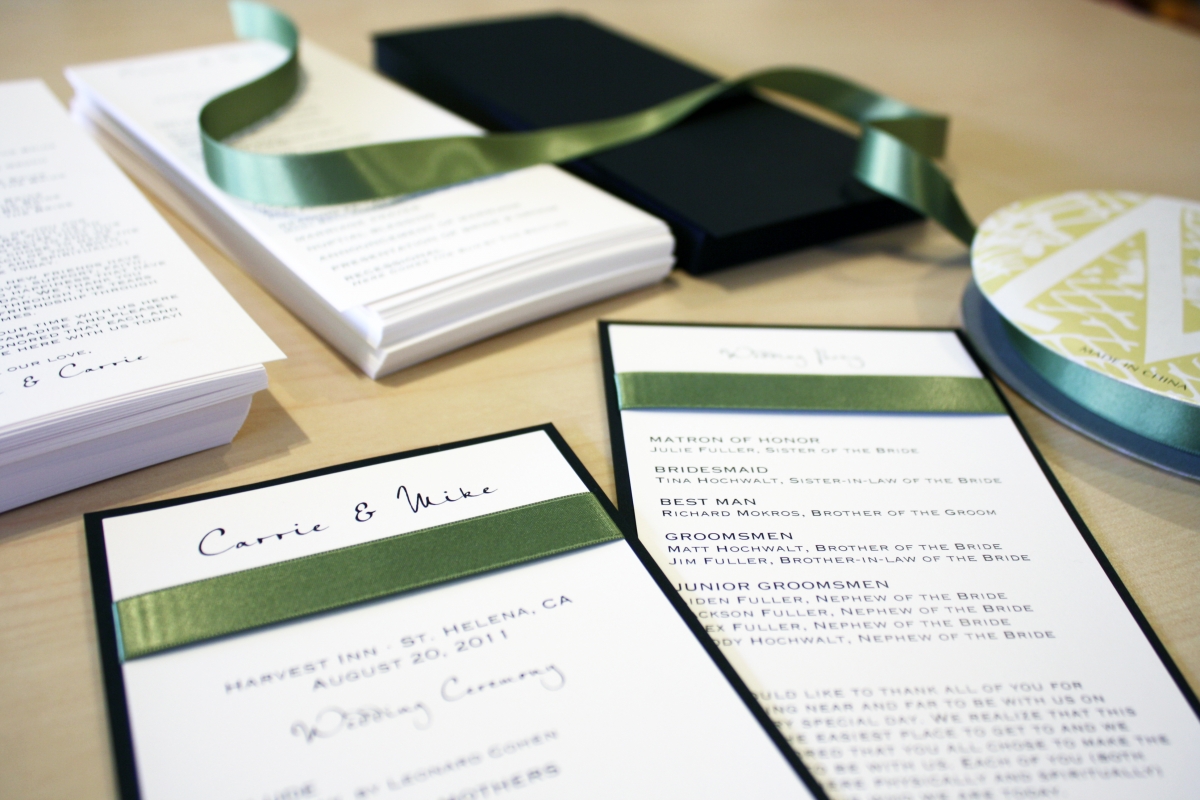
Napa Valley here they come! Carrie and Mike’s invitations were from our custom line, Envelopments, and featured a 7×7 square black linen pocket invitation with a wasabi green accent layer, classic white top layer and enclosure cards, and a green satin ribbon. Since this is a destination wedding, they made sure to include plenty of information about Napa Valley, including travel and accommodations info, and they even planned wine tastings for their guests throughout the weekend’s festivities. They chose a simple format for their program, featured here- a 4×9 black linen card with classic white stock mounted on both sides. The ribbon band added texture and color, and provided a beautiful visual break in the design. Cheers!
Emily + Scott
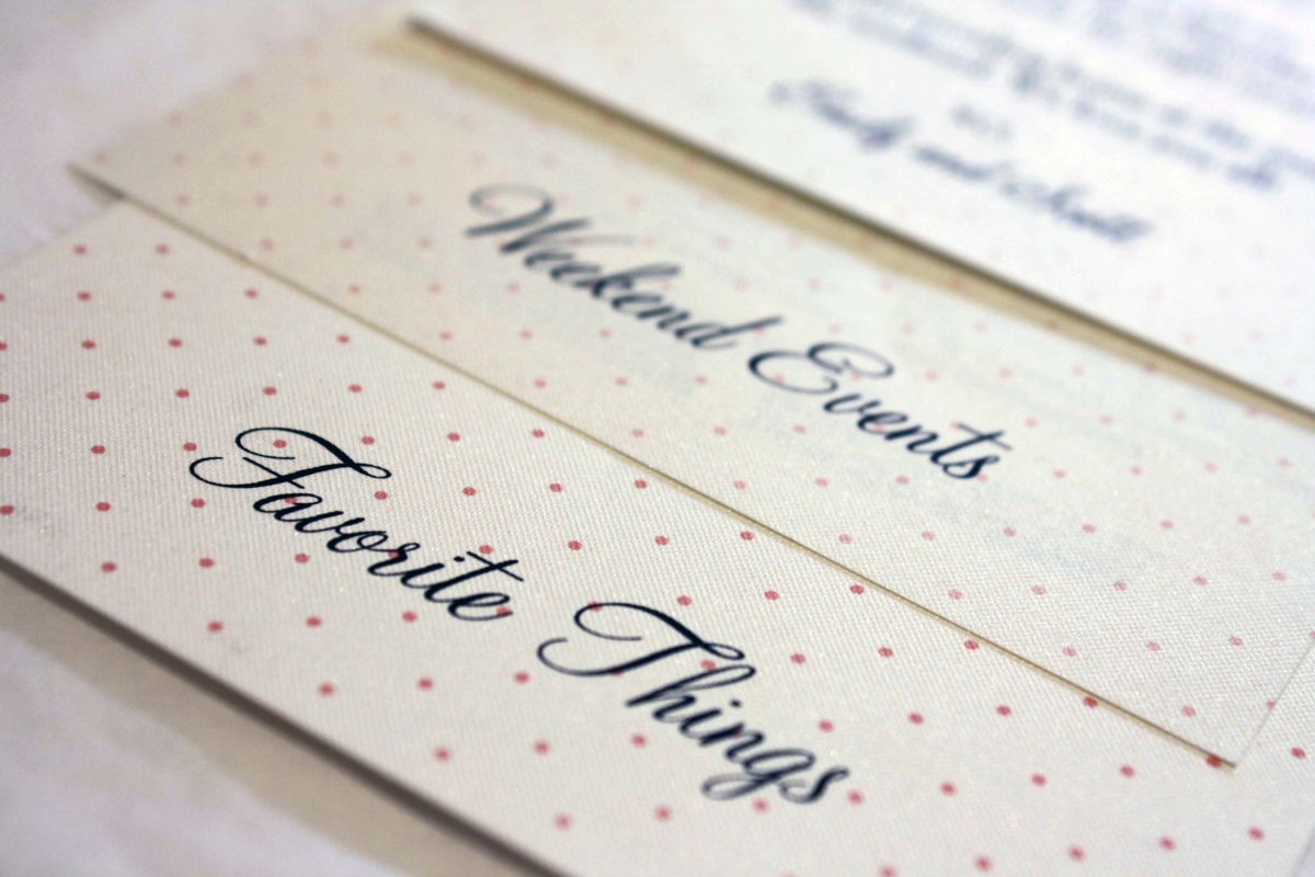
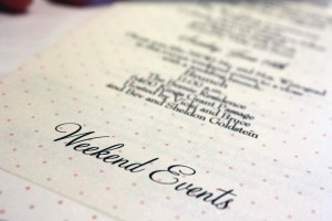
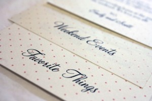
A wedding weekend schedule is a wonderful way to provide tons of helpful information for your guests regarding what to expect the weekend of the wedding. It’s a great place to include a schedule of weekend events, including a “meet and greet”, golf outing or post-wedding brunch, as well as other area information such as local restaurants, favorite coffee shops, museums and other area attractions. Keep in mind that a lot of your guests may be traveling from out of town or out of state and won’t be as familiar with the Dayton area, so giving them tips about what to see while they’re in town- even a suggestion for where to get a good cup o’ joe- will help them feel well taken care of and right at home. The wedding weekend schedule is also a convenient place to list the contact information of the wedding coordinator, or parents of the bride and groom- whoever needs to be available to answer logistical questions during the weekend of festivities. These schedules are typically put in guest bags at the hotel, or left with the concierge under the name of the wedding block so guests are presented with one upon checkin.
Emily and Scott included a heartfelt personal note to their guests, welcoming them to their wedding weekend, as well as a schedule of the weekend’s events and a list of their own personal Dayton favorites. Their guests appreciated the effort Emily and Scott and their families put in to make them feel welcome, and the wedding weekend went smoothly, down to the last detail (which even included Hershey kisses with personalized tags from the happy couple).
