Category: Rehearsal Dinner + Showers
Shower Save the Date
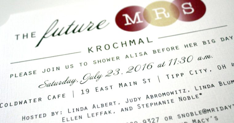
The Future M.R.S.
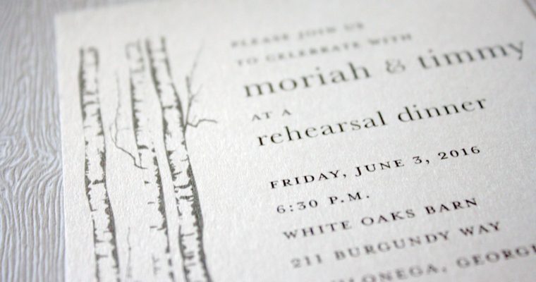
Moriah + Timmy
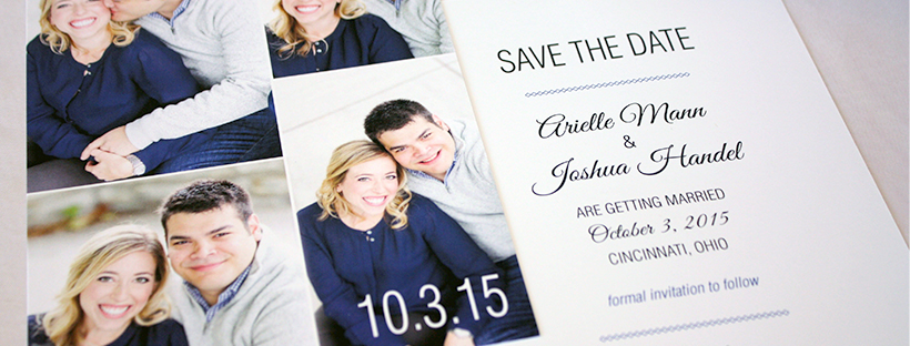
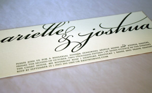
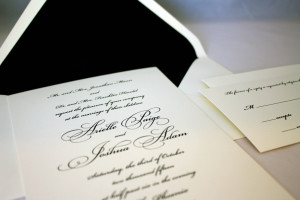
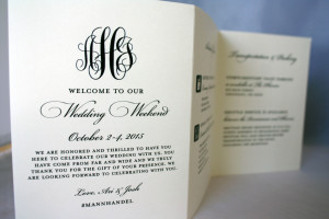
Ari + Josh
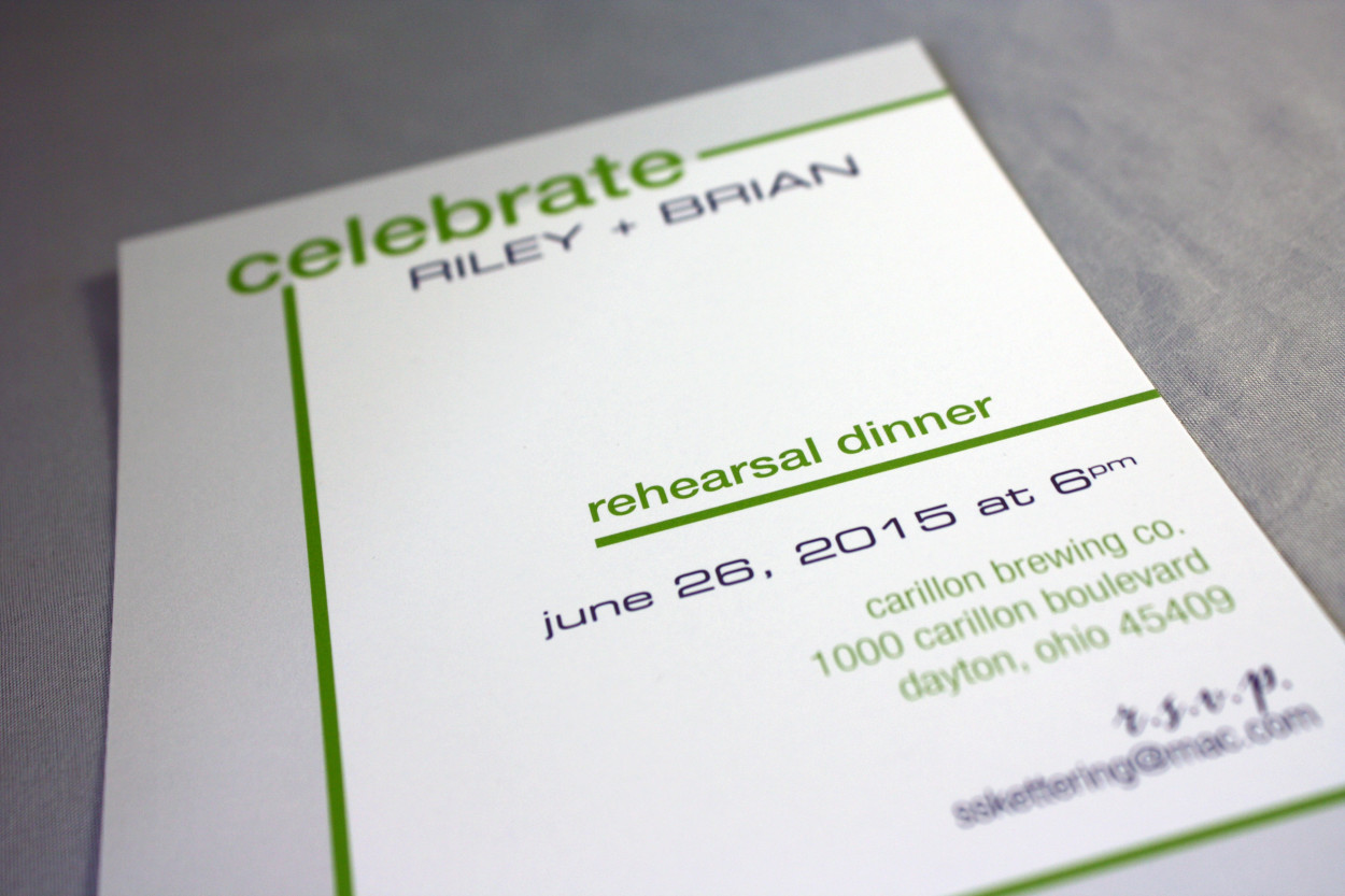
Riley + Brian
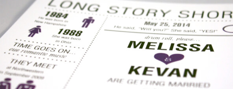
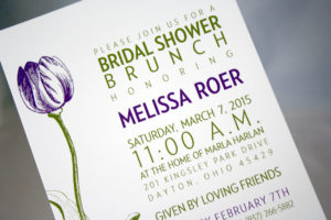
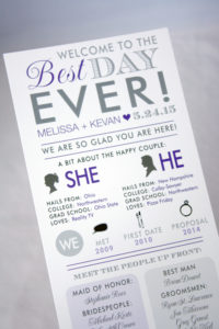
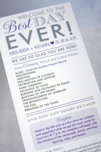
Melissa + Kevan
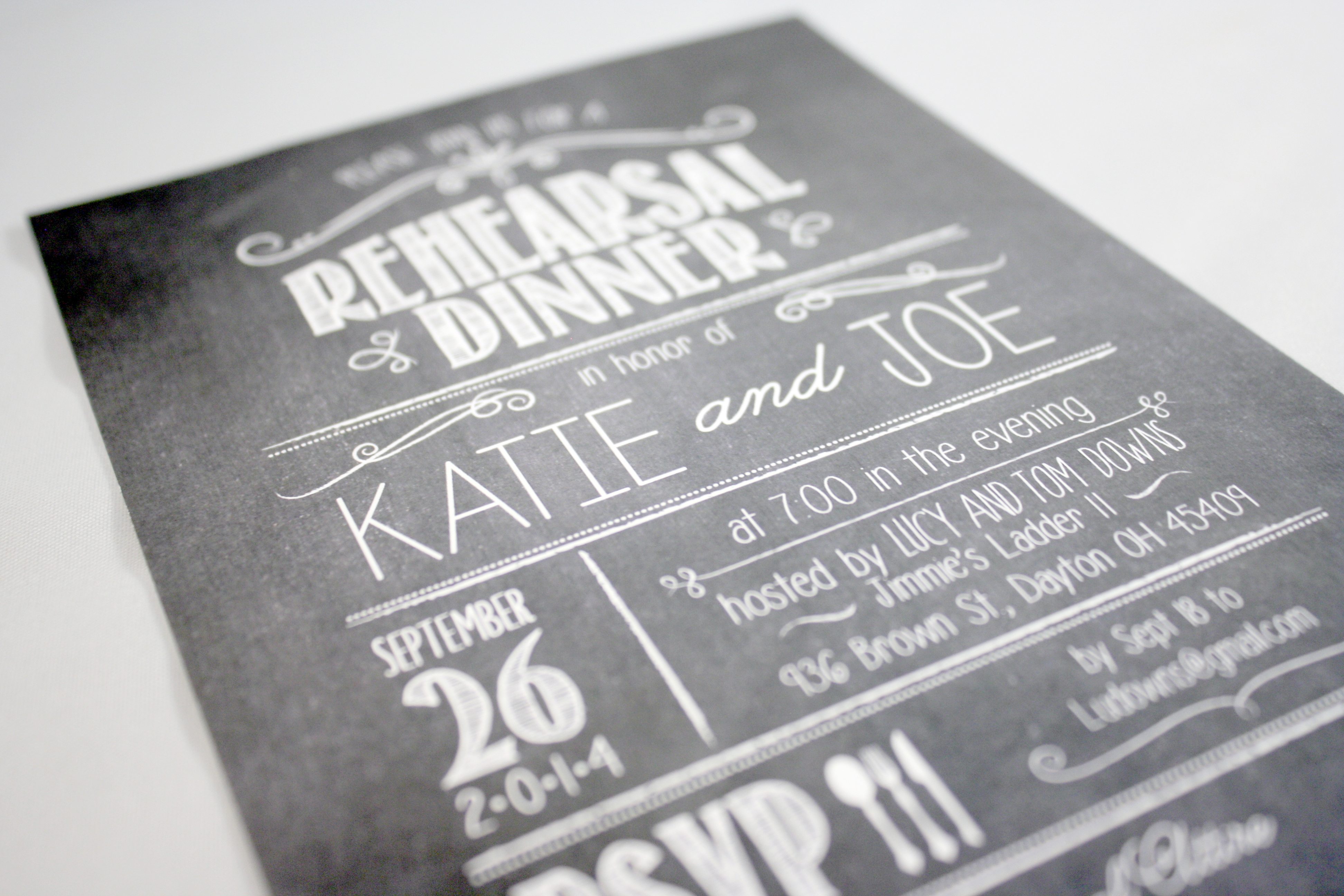
Katie + Joe
Still haven’t quite had enough of the chalkboard look…Especially when it involves really fun fonts, like this rehearsal dinner invitation does.
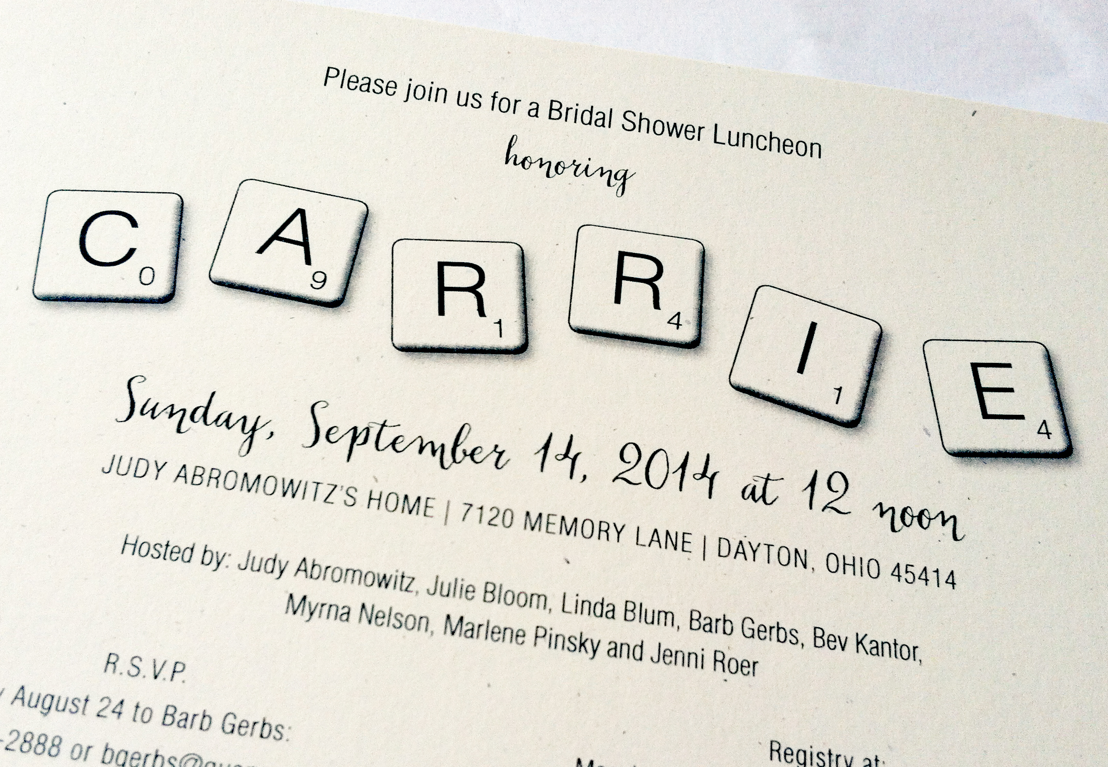
Carrie’s Scrabble Shower
This was one of the more fun bridal shower themes I’ve heard of to date. Carrie grew up playing Scrabble, so the ladies who threw her shower thought it only appropriate to go along with her idea for a theme. They were even able to procure a bunch of Scrabble boards from garage sales to use as decor at the shower… the tiles played a role throughout, and we even printed 3×3″ squares with letters on them to send with the invitations. The idea was each guest was supposed to bring a gift off Carrie’s registry that began with that letter of the alphabet.
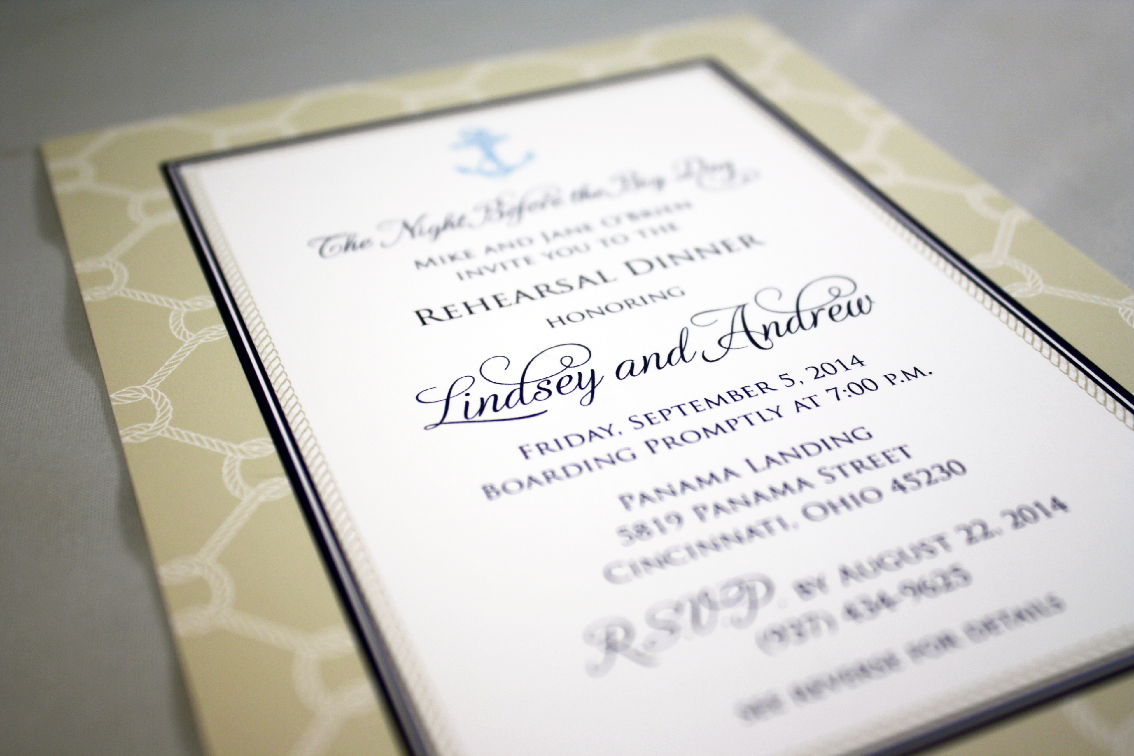
Lindsey + Andrew Rehearsal
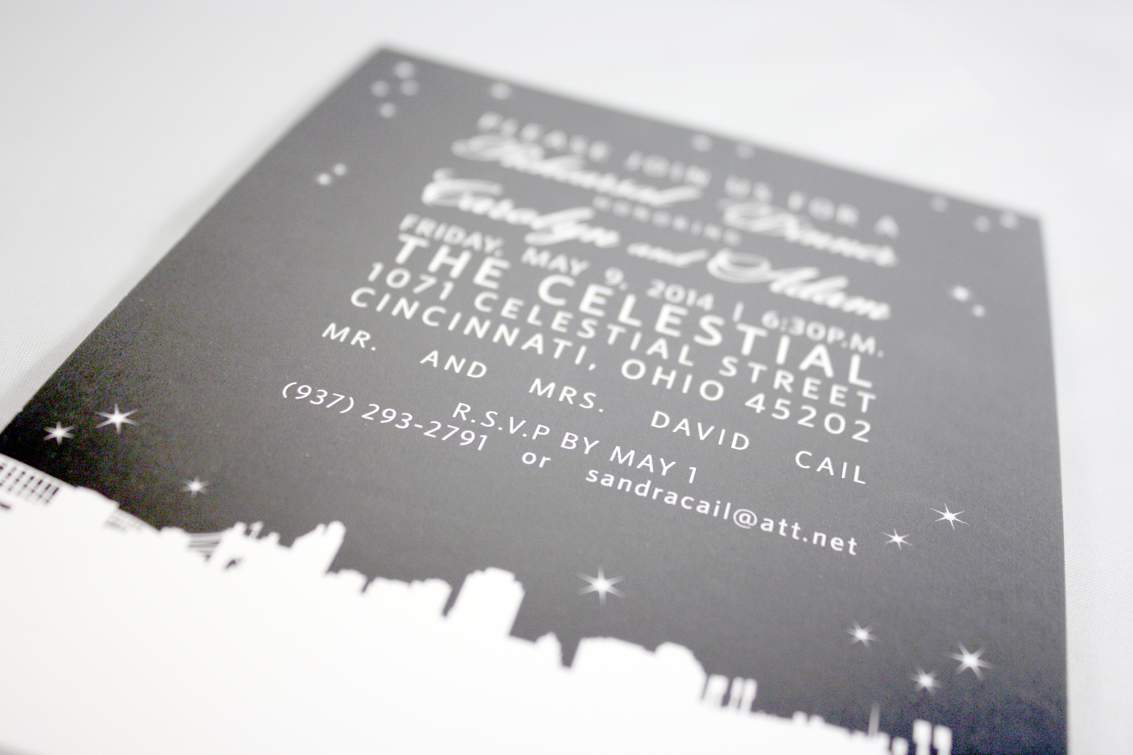
Carolyn + Adam
City skylines made quite a splash in this year’s printed world… Tag and Co. offers some really cool skyline ideas- everything from abstract outlines to more detailed pencil sketches. With the popularity of “going local”, people are developing a healthy sense of pride in their communities and wanting to show off their local love by incorporating skylines of their city on everything from save the dates to rehearsal dinner invitations. (It would also be cool to screen print a skyline onto t-shirts for the bridal party- hint, hint.)
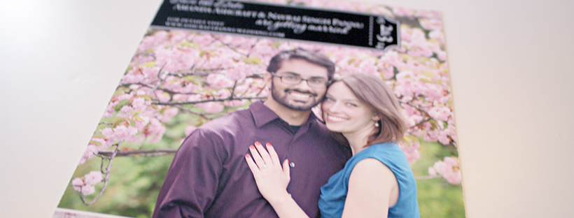
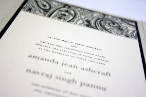
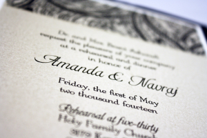
Amanda + Navraj
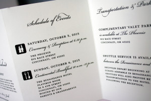
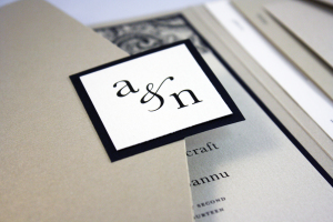
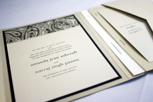
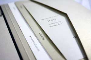
This was another of my favorites this year. The invitation was neutral and formal using a palette of black, a tiny bit of ivory, and shades of gold. We used all metallic stocks, which set an extra elegant tone. One thing that was different about this invitation suite is that it included a card that listed the dates, venues, and locations of all of the wedding events to make it easy for guests to keep track of where they were supposed to be and when. To coordinate with her invitations, we also designed programs and rehearsal dinner invitations in the same color scheme.
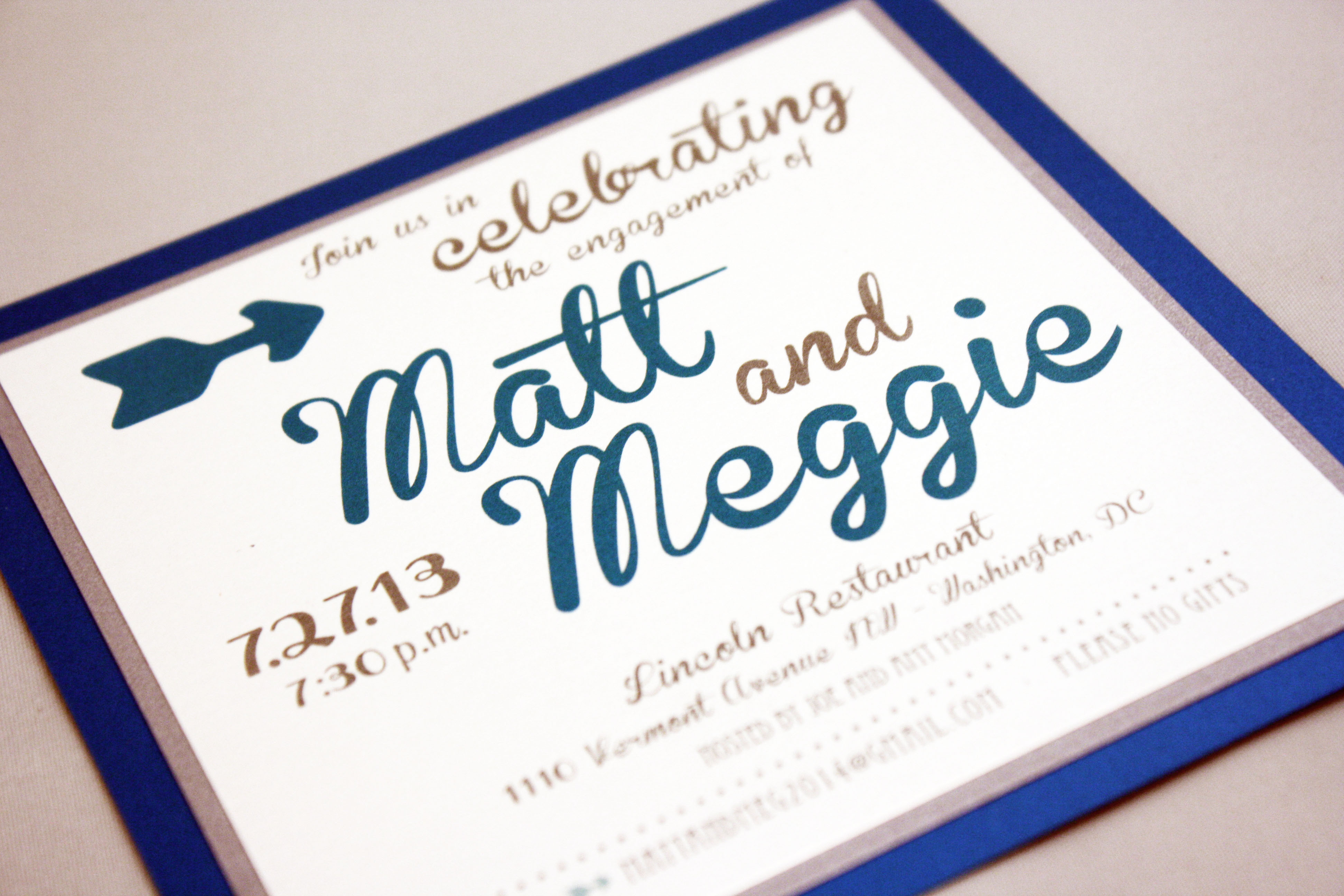
Matt + Meggie
Three layers of metallic silver, peacock blue, and white, coupled with a playful oversized font give this invitation a contemporary lilt.
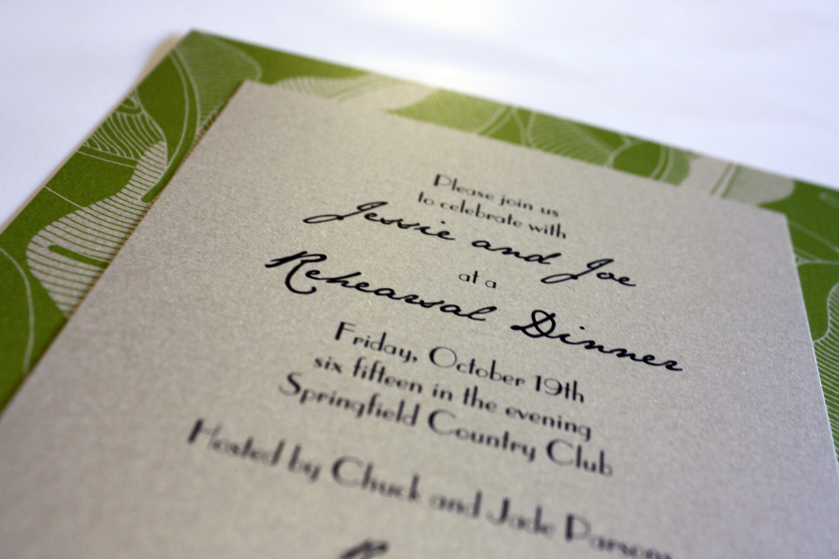
Jessie and Joe’s Rehearsal Dinner
Jessie and Joe’s wedding had an orange and silver theme, but Joe’s mom decided to lend a totally different feel to their rehearsal dinner invitation. The rehearsal was to be held at the Springfield Country Club, and we created a green and pale gold invitation with a modern leaf graphic entwined into the background layer.
Wedding Guest Libs
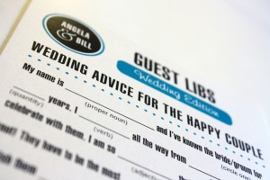
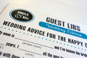
This was an entertaining way to get Angela’s guests involved in providing a fun keepsake for the couple after their Big Day. Angela came to me with this incredibly fun idea- Wedding Guest Libs- into which we easily incorporated her wedding colors of turquoise and mocha. We used the turquoise as a color pop on a crisp white background. Angela’s invitations were from Checkerboard and she had several custom projects she asked us to do to coordinate with that look. Angela felt strongly that her wedding needed to be fun and reflect her and Bill’s personalities, so the Guest Libs idea was perfect because it engaged her guests and gave them something interactive and fun to do at their tables, while providing amusing anecdotes for the couple to read after the festivities were over.
Eat, Drink and Be Married
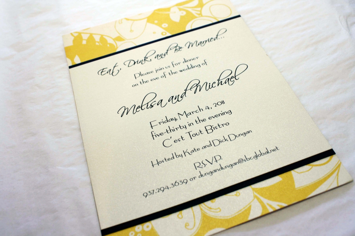
The rehearsal dinner is an important part of the wedding weekend and as such, should have its own invitation to coordinate with the look and feel of the rehearsal dinner venue. Melisa and Michael’s dinner was to be held at C’est Tout, a French bistro in Oakwood that uses a lot of yellow in their French country decor. The mustard yellow in this eclectic pattern was a perfect way to tie in the colors of the restaurant with the overall feel of the event and the style of the couple. Melisa and Michael also opted to use large 12×12 sheets of the yellow patterned card stock as chargers at the place settings that evening, and we did menus to coordinate.
Courtney’s Bridal Shower
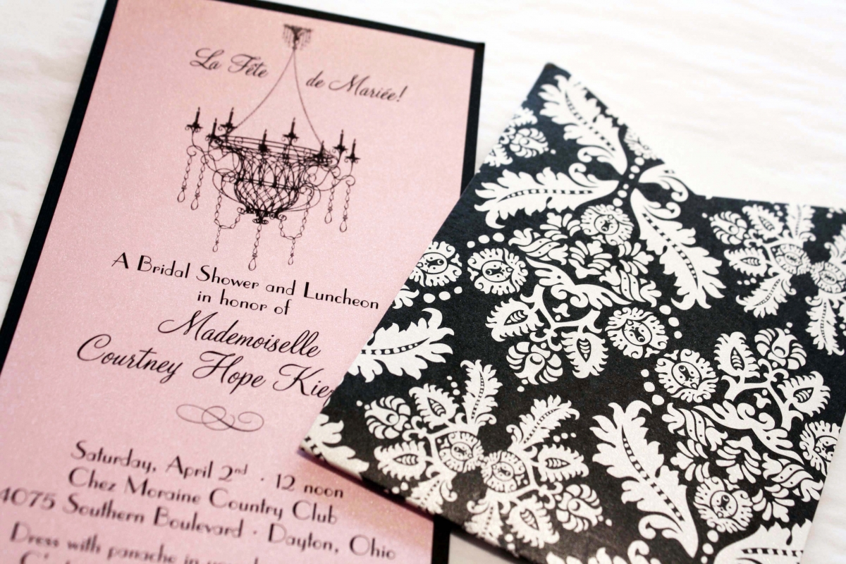
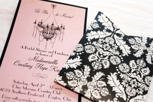
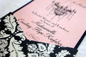
Oh La La! Before her Chateau Elan wedding in Georgia, Courtney’s friends and family threw her a French-themed bridal shower. We wanted to go ultra feminine with the invitations so we used a vintage damask black and white portable pocket with a brocade pattern, as well as a black chandelier graphic that was designed to sit at the top of the invitation so it would be seen while the insert was still in the pocket. We printed the French-English verbiage onto a tourmaline metallic card, mounted it onto a black backing and voila- c’est magnifique!
